
Utilizing systems thinking to fuel rapid growth
After learning from various design systems at previous organizations, I worked closely with our engineers to make a system that enabled us all to move faster with greater cohesiveness.
When
2020 - 2023
What
Design System
Why
Improve Efficiency
Role
Director & Designer
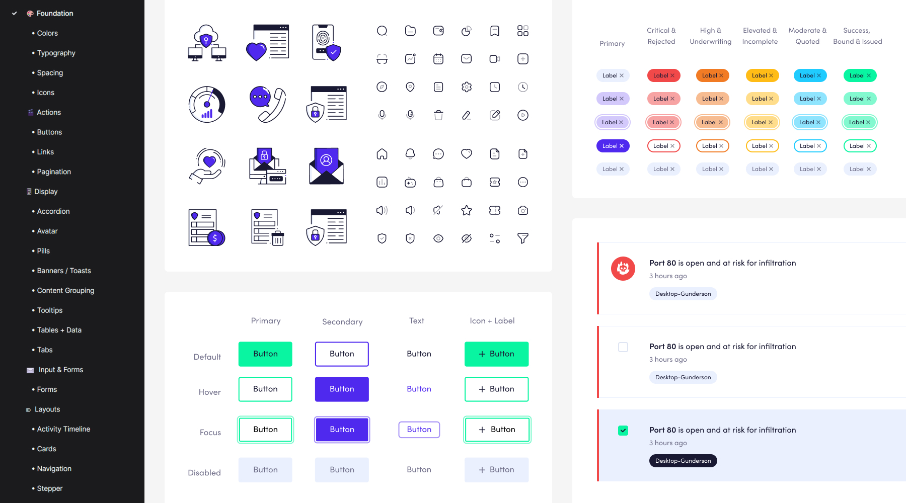
Instead of stifling creativity, the Parade System has laid the foundation for exciting and innovative experimentation by future designers.
Key Takeaways
- Architected, designed, built, and iterated on the Parade Design System
- Gathered and iterated on feedback while developing the MVP of our product, through a series of qualitative 1-on-1 conversations
- Mentored both designers and engineers on the best practices of how to properly implement and utilize a design system
- Set up to scale and white label with variable-based primitives and tokens.
Goals
Building for efficiency, cohesiveness, and scale
When founding the design team at Elpha Secure, I knew to scale quickly I must apply my past experience with design systems immediately. The new design system, Parade, would need to allow all future designers to move at the speed of light and remain flexible enough to retain the delightful experience our users demand. We were starting from scratch — nothing, nada, zilch. As I put the finishing touches on the branding, we had a looming deadline to get our MVP to market for the start of the insurtech season.
Learnings
Shaping the system quickly through real-time feedback
While I hastily built out the frontend of our MVP product, I simultaneously got live feedback from users. This allowed me to begin iterating early on components in Figma using atomic design methodology. Early feedback showed that although the body copy color contrast was WCAG AA compliant, our users were struggling to read it at smaller sizes. I was able to pivot quickly and increase the contrast to 4.92:1. We continued this cycle of measurement and iteration as it grew from a handful of core components to a comprehensive design system.
Standout Moments
Built-in versatility using variants and auto layout
It was vital for me to create components that could be flexible enough to respond to different screens and use cases.
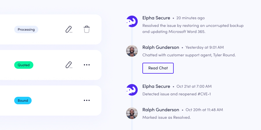
The malleability of the components allows us to produce customized experiences at a blazing speed that don't look cookie-cutter.
Standout Moments
Being a scalable productivity aid — not a creative blocker
By utilizing variable-based primitives and components based on tokens, we were able to create a cohesive, unified visual experience while also reducing non-value-added tasks and increasing productivity.
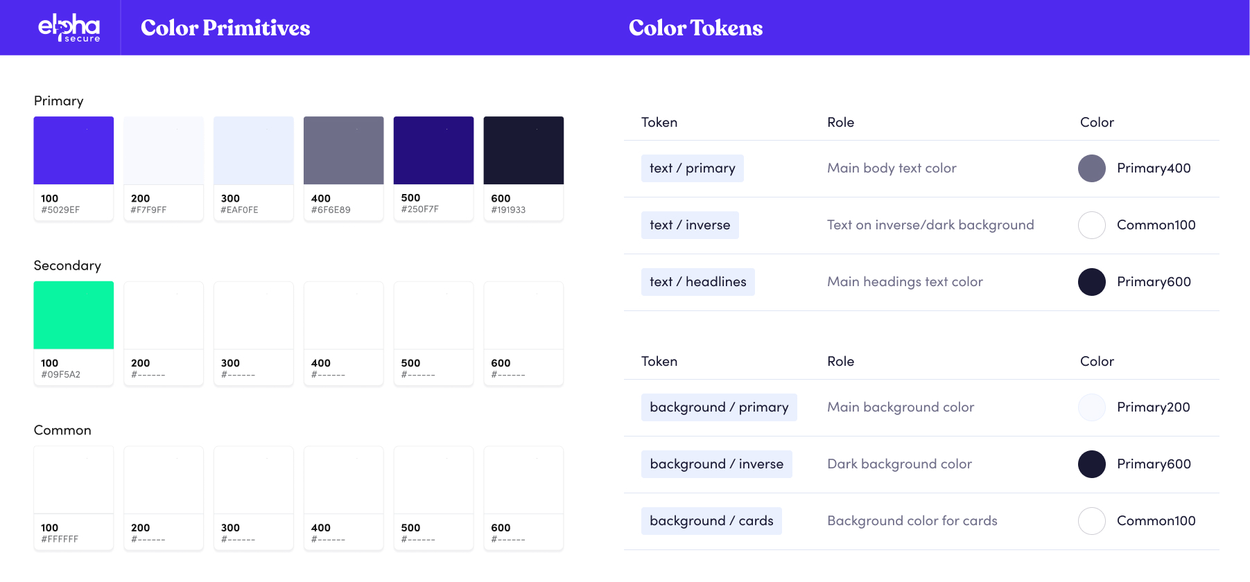
Colors are at the core of every system — Parade is no exception. It starts with primitives that can be assigned to different patterns.
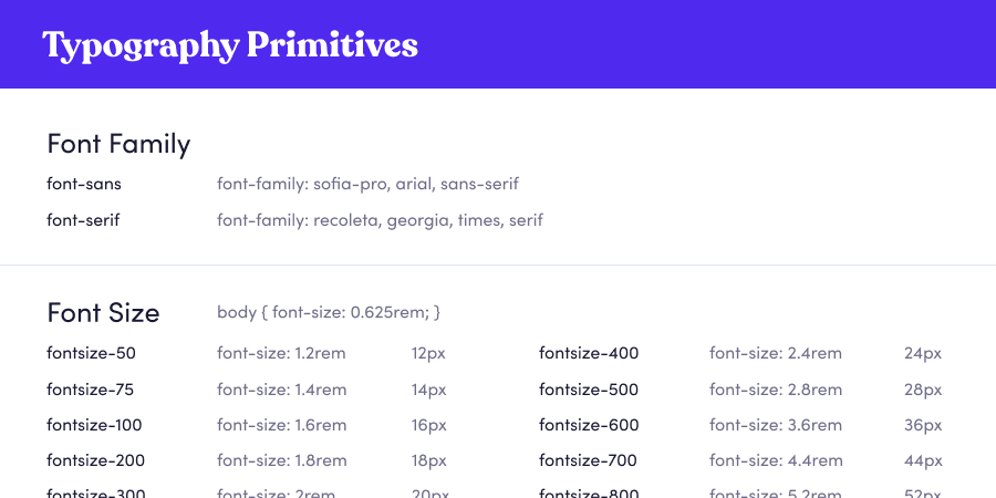
Defining a set number of font size primitives allows us to speak the same language and not get bogged down in pixels or rems.
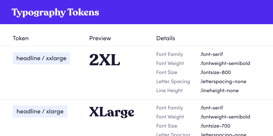
By establishing headline and body tokens, we're able to keep our typography usage consistent — no matter which designer utilizes it.
Due to confidentiality, certain aspects of this project cannot be made public. To learn more about my process, a portfolio presentation can be scheduled.
Let's Chat